


Smart devices now generate a substantial amount of internet Traffic. This change in web scenario gave rise to the Idea of Mobile first approach to build websites.
With mobile audience taking a high priority,real estate on websites never seemed more valuable to the designer.
One of the space saving trick is the Hamburger Menu. Hamburger Menu is a minimalistic icon usually used to hide site navigation and de clutter the mobile site. It sure seems like a simple and elegant solution to save valuable space and it's practically on every Cool website, tempted to implement it in your website? Before you actually do, consider the below mentioned points.
Who are your primary audience?
Studies show that most people over the age 45 do not know what the icon represents. They would never click it unless out of sheer curiosity. Consider that you are designing a pill reminder app and the options to add /remove pills is hidden behind an icon. It is more likely that the user will uninstall your app. (of course after failed attempts to figure it out)
How many main menu items do you have ?
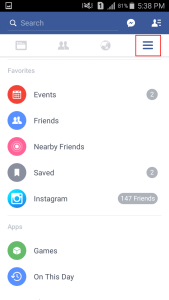
Decide on menu options that should always be present on screen. Consider facebook app as an example
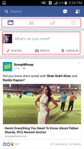
Notice how important icons are placed in a secondary navbar, and you can also see that the status update option is also nicely integrated into the main screen. The app uses Hamburger menu only to hide detailed menu, which most of the users would not be visiting on a regular basis.
What do want the user to see?
If your website content is centered around a particular content and not navigation, like a portfolio site, You want the user to go through your gallery page without getting distracted by other menu options.Hamburger menu might be the right choice for you in such scenarios. https://ewebdesign.com/ is a clean example where hamburger menu is strategically used to get maximum number of newsletter signups.
What are the alternatives?
Taking clue from Facebook App, a designer can implement a secondary navigation bar which displays all “absolute essential” items. While the rest can be hidden behind an icon. A secondary navigation would not be a practical solution to an E-commerce site, in such cases it would be apt to display the icon along with a label which spells out “Menu” or just the word “menu” . It is definitely clearer than the hamburger icon. New trends keep cropping up everyday, and overnight certain designs become “cool” and we will have every other designer play with it like a shiny new toy. Strategically choose the best designs that are suitable for your purpose and that's how you create seamless user experiences.

 Made with Superblog